Today I was reading about CSS3 and I stumbled upon CSS3 regions. I was completely flabbergasted with what I saw and learnt today. Imagine that you’re trying to build a website for a magazine containing multiple columns (say 3). It would be arduous to fix the textual content on a particular column and then move the rest of the text to other columns. Now with Content Flow mechanism, the extra content can be moved to other columns in the layout with ease. There are just a couple of properties that you need to define in the styling sheet and you’re done. But this is not it. When you resize the browser window, the content automatically flows to other regions depending on the browser size.
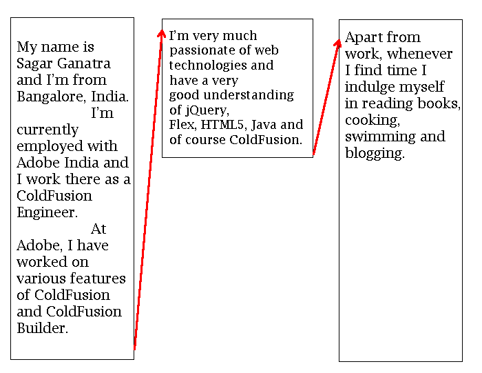
Consider this web page layout containing 3 columns. For the purpose of this example, I have copied the text from my blog’s ‘About Me’ page and have increased the font to describe the flow.

As you can see, the text is split across 3 columns in the page. When you try to reduce size of the browser window, the text automatically moves to the next region and when you increase the size the text flows back to the previous region.
There are couple of properties that you need to set for this content flow mechanism to work. Here’s the code:
As you can see from the above code, the source div has a property '-webkit-flow-into: main-region' and the region class has the property '-webkit-flow-from: main-region'. Here 'main-region' is used as an identifier to move the content from the source div to the various regions. Here's the HTML code:
In the above code, three regions have been defined that would contain the data from the source div. Once '#region1' is filled up with the text, the remaining text content will be passed to the next region '#region2'. And whenever an attempt is made to resize the window, the source data would fill up the regions in the order that they are defined in the page.
As you might have figured it out, this works only on webkit browsers and fails on other.

Click on the demo button to see how this works. Resize the window and observe the behavior.
Consider this web page layout containing 3 columns. For the purpose of this example, I have copied the text from my blog’s ‘About Me’ page and have increased the font to describe the flow.

As you can see, the text is split across 3 columns in the page. When you try to reduce size of the browser window, the text automatically moves to the next region and when you increase the size the text flows back to the previous region.
There are couple of properties that you need to set for this content flow mechanism to work. Here’s the code:
body {
height: 100%;
width: 100%;
margin: 20px;
overflow: hidden;
line-height: 20px;
font-family: Arial, Helvetica, sans-serif;
font-size: 20px;
}
/*
source data available under a div with id - 'column_source'
-webkit-flow-into: main-region instructs the browser to move the
content to another region. 'main-region' is used as an identifier.
*/
#column_source {
-webkit-flow-into: main-region;
text-align:justify;
}
/*
-webkit-flow-from: main-region instructs the browser to get the
content from 'main-region'.
*/
.region {
-webkit-flow-from: main-region;
border: solid 1px;
padding: 10px;
margin-right: 30px;
}
#wrapper_regions {
position: relative;
padding: 25px;
}
#region1 {
width: 20%;
height: 50%;
float:left;
}
#region2 {
width: 20%;
height: 20%;
float: left;
}
#region3 {
width: 30%;
height: 70%
}
As you can see from the above code, the source div has a property '-webkit-flow-into: main-region' and the region class has the property '-webkit-flow-from: main-region'. Here 'main-region' is used as an identifier to move the content from the source div to the various regions. Here's the HTML code:
<body>
Resize the browser window.
<!-- source region -->
<div id="column_source">
<p>My name is Sagar Ganatra and I'm from Bangalore, India.
I'm currently employed with Adobe India and I work there as a ColdFusion
Engineer. At Adobe, I have worked on various features of ColdFusion and
ColdFusion Builder. I'm very much passionate of web technologies and
have a very good understanding of jQuery, Flex, HTML5, Java and
of course ColdFusion. Apart from work, whenever I find time I indulge
myself in reading books, cooking, swimming and blogging. This blog is
dedicated to my views and ideas on the technologies that I work on, I
also blog about my views on everything else that crosses my mind and
on those light moments at sagarg.posterous.com</p>
</div>
<!-- regions where the above content would be displayed -->
<div id="wrapper_regions">
<div id="region1" class="region"></div>
<div id="region2" class="region"></div>
<div id="region3" class="region"></div>
</div>
</body>
In the above code, three regions have been defined that would contain the data from the source div. Once '#region1' is filled up with the text, the remaining text content will be passed to the next region '#region2'. And whenever an attempt is made to resize the window, the source data would fill up the regions in the order that they are defined in the page.
As you might have figured it out, this works only on webkit browsers and fails on other.

Click on the demo button to see how this works. Resize the window and observe the behavior.
Can you flow into and activate as the screen grows smaller?
ReplyDeleteIf I understand you right, if the screen is resized by reducing width\height then the content should flow from one div to the other. This is possible. If you try the demo on Chrome and when you reduce the size of the window, you'll see that content would flow from one div to the other.
ReplyDeletewhy are using
ReplyDelete-webkit-flow-into and not
flow-into?
This feature is not available on all browsers, currently chrome supports it but it has added the -webkit prefix for the property 'flow-into'. I think once this feature is implemented by all browsers, using a property without prefix would make sense. So meanwhile, one has to use -webkit prefix while defining the property.
ReplyDelete